9. Organizer View
Organizer View — Kanban, Storyboard & Column Layouts
The Organizer View (formerly known as Power Grid View) gives you powerful visual layouts for your cards — think Kanban boards, storyboards, swim lanes, and column views. It leverages the Groups and Tags you've already created to arrange cards in ways that a simple grid can't.
Switching to Organizer View
From inside any stack:
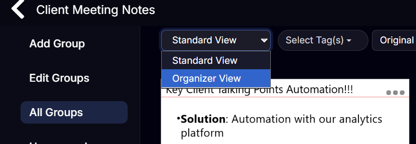
- In the filter bar at the top of the Cards View, click the View dropdown (shows Standard View by default).
- Select Organizer View.
You can set Organizer View as your default for a stack in Settings → Default View.
Layout Options
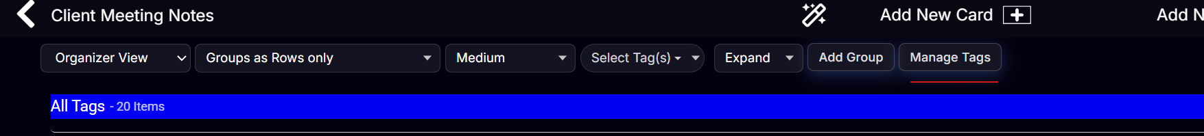
In Organizer View, a row of layout controls appears at the top. You can arrange your cards in several configurations:
| Layout | Description |
|---|---|
| Groups as Rows | Cards displayed in horizontal rows — one row per group (storyboarding) |
| Groups as Columns | Cards arranged in vertical columns — classic Kanban layout one column per group |
| Tags as Rows | Cards grouped into rows by tag — see all cards with a tag at a glance |
| Tags as Columns | Cards grouped into columns by tag — great for status workflows |


Working with Groups as Rows or Columns
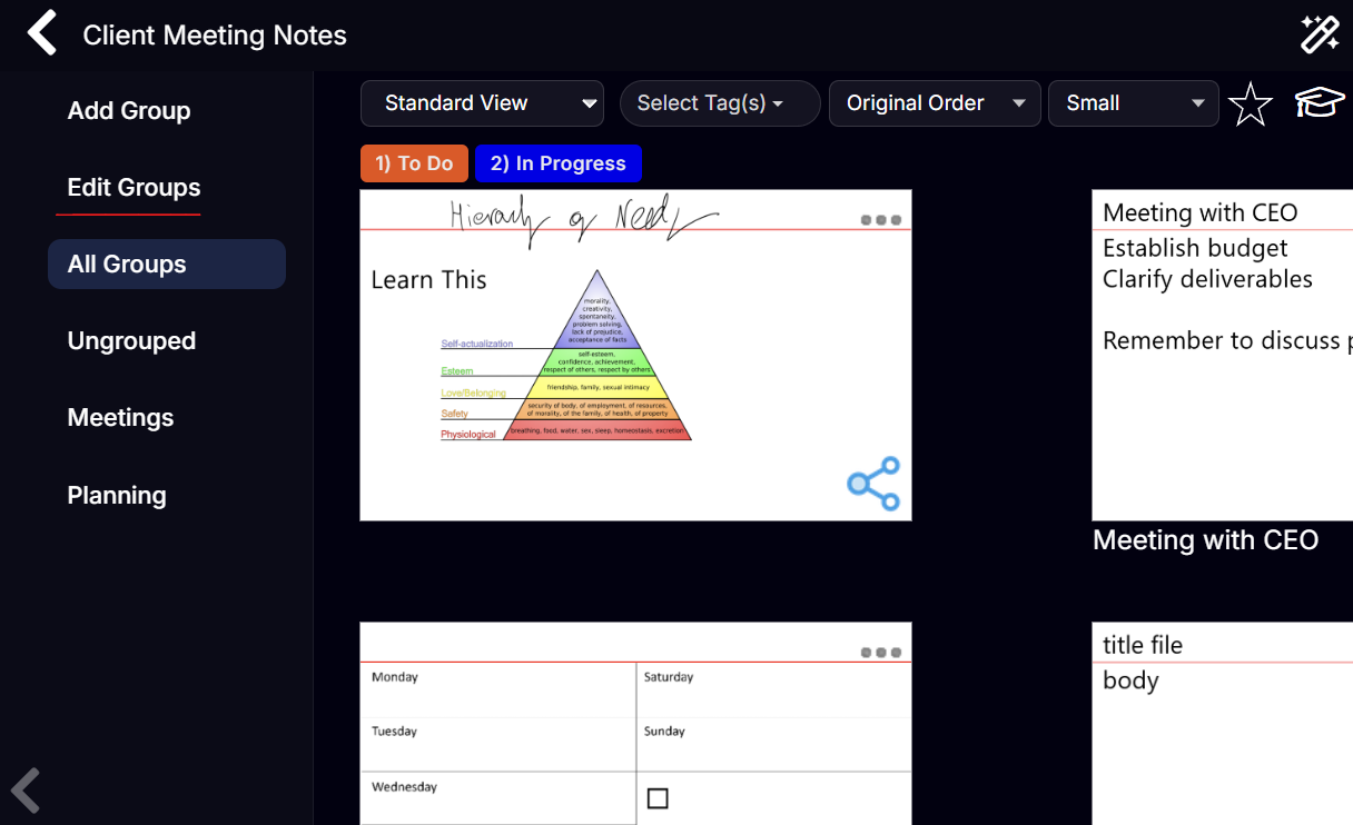
Collapsing Groups
Next to each group name is a small collapse arrow. Click it to fold that group's cards out of view — useful when you want to focus on a particular section without distraction. Click again to expand.
Adding a Card to a Specific Row/Column
Click the + button that appears at the end of any row or column to add a new card directly into that group — the card is automatically assigned to that group.
Moving Cards Between Groups in Organizer view
- Drag and drop: Drag a card from one group row/column to another.
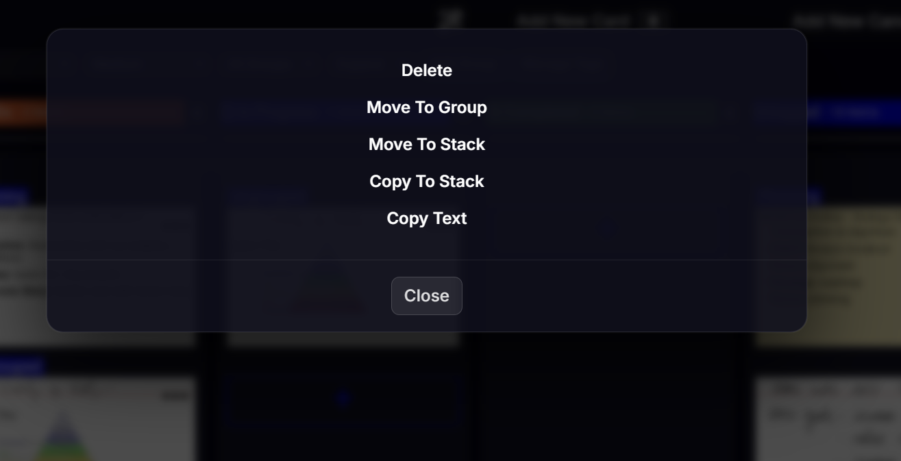
- Menu: Click ... on the card → Move To Group → select the destination group.
Using Organizer View as a Kanban Board
The most popular use of Organizer View is a Kanban board for task and project management.
Set-up:
1. Create groups named To Do, In Progress, and Done (or similar).
2. Switch to Groups as Columns.
3. Each column represents a stage — drag cards across columns as tasks progress.
You can use any group names that match your workflow: Backlog / Active / Review / Complete, Act 1 / Act 2 / Act 3 for writing, or Briefings / Specs / Budget for a project.
Note that the order which the columns show (for Group or Tag) is defined by the order they appear in the Group or Tag management. So to have a column appear in different position ensure that it is in the right order. We include the 'Manage Tags' button for convenience.
To edit the Groups to re-order go back to Standard view and click in 'Edit Groups' on the left.
Using Tags as Columns for Status Filtering
If you've tagged cards with status labels (e.g. To Do, In Progress, Done), choose Tags as Columns for a dynamic board that doesn't require moving cards — just re-tagging them.
Reordering Cards Within a Group
In Organizer View you can drag cards to change their order within a row or column, just as in Standard View.
Standard View vs Organizer View
| Feature | Standard View | Organizer View |
|---|---|---|
| Layout | Responsive grid | Rows or columns by group/tag |
| Drag to reorder | Yes | Yes |
| Collapse sections | No | Yes (per group) |
| Add to specific group | Via menu only | Click + in the row/column |
| Best for | General browsing, search | Project management, Kanban, storyboarding |